 New Bedford Guide Your Guide to New Bedford and South Coast, MA


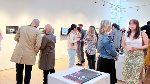
I would strongly suggest that those interested in typography and arts spend some time viewing the interior of the Seamen’s Bethel. Inside, the extraordinary cenotaphs are suspended on the walls far above the pews that line the central portion of the floor. A balcony around the perimeter allows for access and close viewing of these cenotaphs. In my experience,and with a collegiate background in Graphic Design/Letterform, I immediately noticed a cenotaph which exhibited striking resemblance to the classical typeface Bodoni.
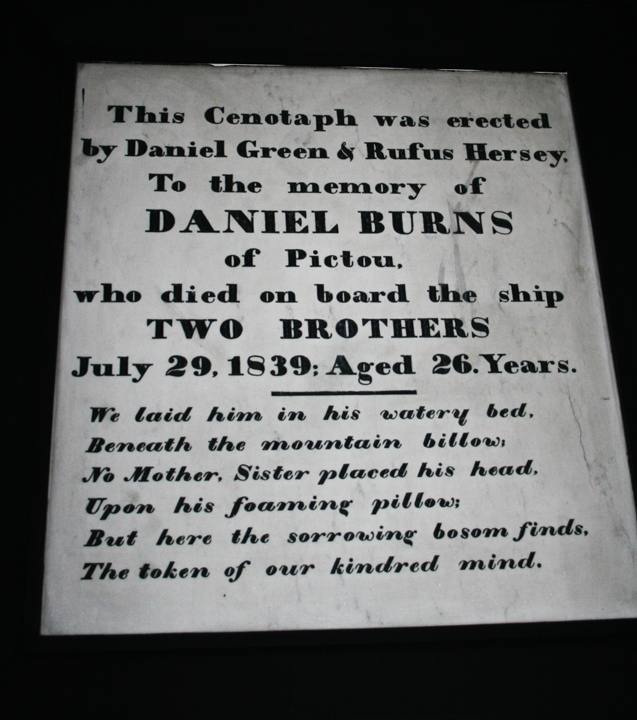
Bodoni is an elegant typeface which evolved from handwritten text. It is considered a modern font with anatomically thick stems and skinny serifs. If you’re interested in the trade, pictured below below and to the left is a macro image I took of the beautiful numbers carved into the aforementioned cenotaph. I have labeled a few key elements of typographic characters that artists use to describe the anatomy of letters and numbers.
Typography is a diminishing art form. Listed below are some of the most important structural terms used to define letterforms and how they relate to each other. These elements are what make hand-produced type so elegant, raw and stunning:

A. serif :: foot at the end of a stroke
B. baseline :: letterform base
C. stress :: orientation of the letter form
D. finial :: rounded non-serif terminal to a stroke
E. counterform :: negative space within letterform

I do believe that the chiseled appearance of the cenotaphs express the rawness and magnitude of the tragedy they recall. Typographers must deal with issues such as readability, style, space, size, hierarchy, and individuality, as well as the effectiveness of conveyed message. It is the manner in which a typographer utilizes his canvas that directly influences the feelings evoked in the viewer.
Here the written word is communicated in a tactile manner, as close observance reveals an imperfect yet beautiful arrangement of letters and numbers. Every character has an individual quality, and no two are alike. You can feel the history cascading off the surface with it’s chiseled design, porous stone, and faded undertones. Contrasts between the smooth surface of the stone and the jagged, asymmetric symbols facilitate the characters to truly express their similarities and differences; they almost assume a personality of their own. Serene balance, aesthetic satisfaction, and comfortable eye movement throughout the piece creates a pleasant encounter for the spectator.
Johannes Gutenberg invented printed letters in the fifteenth century by casting individual blocks of lead. Each block had a relief of a singular letterform. Gutenberg’s classification consisted of literally thousands of metal pieces bearing letterforms that were organized into wooden boxes containing a grid framework. In newspaper printing, one would arrange the blocks into desired text, ink the protruding surface of the letters and finally send the ink-covered text and paper through a press.

Gutenberg’s system was based solely upon the literature of ancient, natural handwritten scripts. Subsequent forms of printing deviate away from the elegance and sacredness of the classical ink and hand style of writing. Written text indeed functions as a means to represent ideas, but how it is conveyed (substance wise, mechanically and aesthetically) depends upon the emotional and physical response of the reader. We understand the meaning of written characters only through association and language, but notice how written words and type style can influence the way you perceive a letter or document.
In the case of the Bethel cenotaphs, each is elegantly carved with sinuous lines and ornamentation that further solidify in our minds that these are memorial plaques to honor the soul of a deceased person and represent the idea of their eternity as an honorary societal member. Can you feel a natural connection between the words and their meaning?
Picture the same human accounts typed on paper, for instance in a typical Times New Roman font. Would the words have as much of an impact on your emotional chords? Would you maybe view it as more hollow, unable to evoke the tragic nature of the situation? In my opinion, definitively and unequivocally, yes. Idiosyncrasies spotted in the stone and carved type captivate,liven, and season the allure of these characters; anthropomorphic in personality and indelible in nature. I suppose you would have to experience the cenotaphs in the flesh to genuinely appreciate the impact their design has on the observer. It is truly amazing how our human minds relate words with pictorial images, smells, tastes and memories.
Typography is an art, but it is a dying craft. If you would like to learn more about how typography is implemented into the gravestone carving process, please visit here or here.
Jennifer Violette recently graduated from Umass Dartmouth with a degree in graphic design. She is available for questions, comments, and freelance design work. She can be reached at: javisions@gmail.com.